
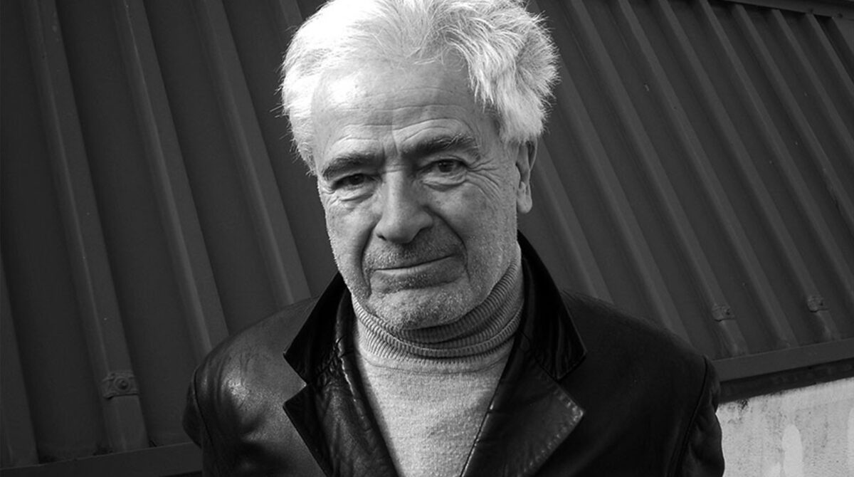
He was born in Cuenca in 1936 and has just left us at the age of 89. What he leaves behind is a part of the visual memory of several generations: the Correos postbox, the fist and rose of the PSOE, the typography of Diario 16 and El Mundo, the Repsol mark, the peseta banknotes in circulation until the euro, the coat of arms and flag of the Community of Madrid, the uniform of the Policía Nacional, and the identities of Renfe, COPE, Endesa, the Tesoro Público, Fundación ONCE, and many more. Images that most Spaniards have seen thousands of times, often without knowing who signed them. That effective anonymity was, in its way, the highest possible tribute to their author.
Cruz Novillo began as a draughtsman at Publicidad Clarín in 1958, in a Spain where graphic design was still an activity without a name of its own. He summed it up with an almost programmatic simplicity: “I am a draughtsman; I always have been.” That condition was not modesty but method — a way of understanding the craft as observation, synthesis and the construction of form. In 1959 he began collaborating with SEDI, the Sociedad de Estudios del Diseño Industrial, and promoted one of the first specialist publications in the field in Spain, Temas de Diseño. In 1964 he was part of the team of artists at the Spanish Pavilion at the New York World’s Fair, an experience that would shape his understanding of design’s public dimension. The following year, at twenty-nine, he left Clarín and founded his own studio.


What came next is inseparable from the most intense period of transformation the country has known. The Spain of the transition and the decades that followed needed to give itself a new image: political parties, public institutions, emerging companies, media outlets, organs of state. Cruz Novillo understood that demand in a way that went beyond the commission. For him, designing an identity was not about solving a recognition problem but about helping to make legible a reality that was changing. His marks are memorable less for their originality than for their precision. Geometry, the use of positive and negative, a synthesised line and a formal economy: that was the language with which he built a visual vocabulary that still retains much of its force today.
He was also a film poster designer, and this aspect of his work — often overshadowed by his corporate identities — reveals another dimension of his graphic intelligence. The posters for El espíritu de la colmena, El sur, La escopeta nacional, Los lunes al sol, Barrio, Cría cuervos and Deprisa, deprisa belong to the visual history of Spanish cinema. In each of them, Cruz Novillo solved the same problem he faced with a brand: finding the direct, intention-laden image that could survive the noise and endure.
But to reduce him to the designer of great logos would be to stop at the surface. From the 1970s onwards, Cruz Novillo participated regularly in international art fairs — FIAC in Paris, Art Basel, Art Cologne, and ARCO from 1985 — with his own plastic work. A painter, sculptor and printmaker, he belonged to a generation that saw no clear boundary between design and art. His commercial work did not diminish his creative ambition; his artistic practice did not remove him from the real world. That tension, sustained well over decades, explains part of his importance.


From the 1990s he developed the concept of Diafragma, a line of artistic research in which he combined colour, sound, time and mathematical structure. His Diafragma dodecafónico 8,916,100,448,256, opus 14, premiered at ARCO in 2010, was conceived as a work of more than three million years’ duration that generates a unique and unrepeatable audiovisual piece every twelve seconds. The scale of that proposition was not a conceptual joke but the logical consequence of a way of thinking about time as artistic material. On 22 May 2009 he had delivered his inaugural address to the Real Academia de Bellas Artes de San Fernando premiering the concert Diafragma heptafónico 49, opus 13, confirming that academicism and the avant-garde held no contradiction for him.
In 2007 he founded, together with his son Pepe Cruz — designer and architect — the studio Cruz más Cruz, continuing a way of working centred on visual identity and the relationship between brand, space and form. He was awarded the Premio Nacional de Diseño in 1997, the Medalla de Oro al Mérito en las Bellas Artes in 2012, and the Laus de Honor in 2023. In 2019 he was named Honorary Postman of Correos — the seventh in the institution’s three-hundred-year history — whose identity he himself had designed decades earlier. That same year the documentary El hombre que diseñó España, by Andrea G. Bermejo and Miguel Larraya, was released: the title was a statement, not a hyperbole.


The disappearance of Cruz Novillo deprives Spanish design of one of its most solid and enduring voices. But perhaps the most revealing thing about his legacy is precisely its invisibility: the signs he built draw no attention to themselves, only to what they name. That is the aim of designers who understand the craft as a service to collective intelligence. For nearly seventy years, Cruz Novillo drew and drew until he found the exact form. The result is everywhere, so thoroughly integrated into the everyday landscape that we no longer recognise it as design. We recognise it, simply, as reality.